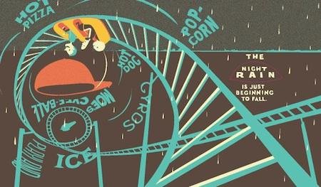
• Posted on December 20, 2015

Marguerite’s Christmas


Marguerite’s Christmas isn’t for everyone.

The story of a fragile, elderly woman alone on Christmas Eve will leave some wondering if this is appropriate subject matter for children. Others will wonder if its appropriate subject matter for adults, given its juvenile format.

But it is a book for me, and anyone who sees storytelling as non-exclusionary. All stories have a place in children’s literature, as long as they are told well, told sensitively and honestly, and in the case of picture books, told with illustrative depth.

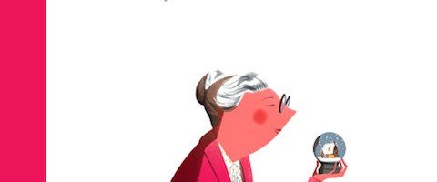
Marguerite’s Christmas is an extraordinary book. Written by Québecois author India Desjardins and illustrated by Pascal Blanchet (Trois-Rivières), Marguerite’s Christmas is one of the most beautiful books in recent memory, and it also deeply sad, because in Marguerite’s solitude we as readers want to reach out to her, even though her reality – being alone at Christmas – is not particularly unusual. The elderly are not always surrounded by family during the holidays like we see on TV, and some people, perhaps many people, are lonely at Christmas.

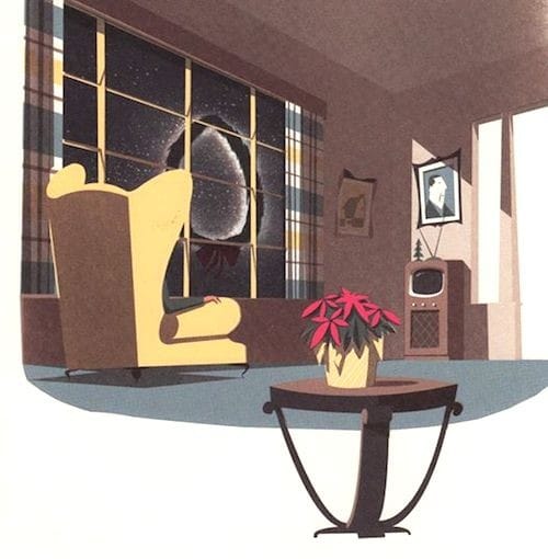
Marguerite's Christmas tv room

It’s difficult to know if I am ascribing feelings to Marguerite that she herself does not possess. She claims to be happy cocooning in her home, enjoying comforting rituals like watching her favourite holiday movies and not bothering with the tiresome fuss of Christmas. Many of her friends and family have died, and she is no longer interested in making new memories, just revisiting old. She repeatedly reassures her family that she is OK.

And yet, she is frequently startled by routine noises and fears going outside as if suffering from mild agoraphobia. She could probably use some company, but rejects it. Clearly, Marguerite is nearing the end, and at one point even imagines the grim reaper at her door. The scenes that follow give me pause. Is the episode with the car actually happening, or is it part of her ‘passage’ to the other side?

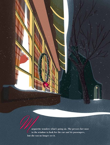
Marguerite's Christmas outside dark

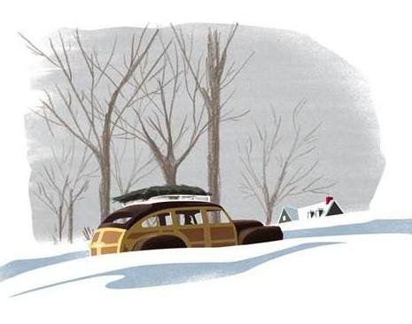
Unlike some adults (or this adult), children will take Marguerite at face-value. The story will not make them uneasy. Instead they will be engaged by Marguerite’s predicament, by her haplessness and vivid imagination (stunningly expressed by the illustrator). Marguerite is a real character. She is endearingly quirky and fastidious. In the most transcendent moment of the book, her kind heart triumphs over her natural reticence when, in spite of her apprehension about venturing outdoors, she helps a stranded family in a broken-down car. It has been a very long time since she has been outside, and the stillness and chill of the winter night releases her fear.

Marguerite's Christmas looking outIt’s a brave and respectful move by India Desjardins to tell this unvarnished story of an elderly person’s winding-down life, and pitch it at children. For everyone, life is a journey, and each moment has its inherent pleasures and torments. And even when you least expect it, a moment of wonder.

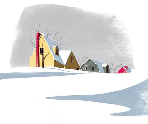
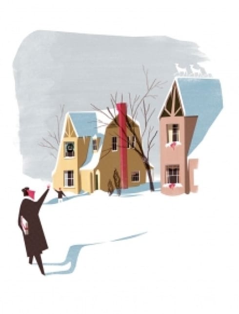
The illustrations by Québec illustrator Pascal Blanchet elevate Marguerite’s Christmas into classic holiday fare, pulling out and intensifying the humour and poignancy of Desjardins words. The art is simply stunning, full of quiet, snow-dolloped streets and retro-heavy vignettes that draw from Marguerite’s life, past and present. The exaggerated angles, stylized imagery and flat colours are very much in the manner of Eyvind Earle, one of Disney’s finest background artists. Several years ago, I bought a book of his Christmas card illustrations (800 in total). Blanchet’s winterscapes seem plucked from that magnificent collection of cards Earle created over 60 years ago.

Marguerite's Christmas landscape

Marguerite's Christmas landscape CAR

Marguerite’s Christmas is perfection from the storytelling and illustration to the candy cane end-papers and placement of the type. It’s one of those books where everything works in exquisite balance, each element enhancing the expression of the other. Yes, it is at times an uneasy, layered read, but it is also deeply touching. I’ll not soon forget Marguerite. I feel like I’ve known her my whole life.

Marguerite’s Christmas by India Desjardins, illustrations by Pascal Blanchet. English edition, published by Enchanted Lion Books, 2015.

The original French edition of Marguerite’s Christmas, Le Noël de Marguerite (Les Éditions de la Pastèque, 2014) was shortlisted for the 2014 Governor General Literary Award in Canada for both text and illustration.

For more CHRISTMAS PICTURE BOOK REVIEWS, click HERE. Within that post, is a link to an even longer list of Christmas books!
Marguerite's Christmas fellow walking

  • Posted on November 15, 2015

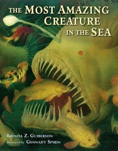
The Most Amazing Creature in the Sea

When Brenda Z. Guiberson met Gennady Spirin, the picture book gods and godettes smiled. Since their original collaboration Life in the Boreal Forest, the talented twosome have been creating THE Most Amazing covermost beautiful, non-fiction picture books around. It’s not possible to pick a favourite, although I will admit to a strong affinity for the frogs in Frog Song, and as a resident of the north, how could I not love the moose in Life in the Boreal Forest?

Nevertheless, their newest venture The Most Amazing Creature in the Sea is truly amazing, as the title suggests. It’s so strangely beautiful, in fact, it could be a collection of alien creatures as imagined by some unfathomably inspired and slightly demented dreamer.

In the interest of full disclosure, I am not a fan of the sea. I respect it, I worry about it, and I’ve enjoyed dipping my toes in it, but aesthetically – I prefer a nice tree over a squid. For reasons that I don’t quite understand, fish creep me out.

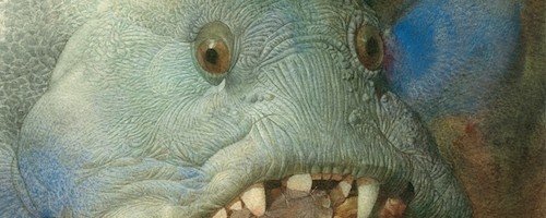
The Most Amazing Creature in the Sea will not endear the squeamish, like me, but it will beguile. The creatures range from Box Jellyfish (and its millions of stinging toxic cells) to the truly bizarre Barreleye Fish, also known as the spook fish – for good reason: it’s got a transparent head. There are other non-orifice-clenching sea dwellers represented in the book, like sharks and leatherback sea turtles, but each in their own particular and often peculiar way, are vying for the title of the most amazing creature in the sea.

Most Amazing Barreleye Fish

It’s a great premise. Each creature makes its case, and each one is stranger, in an evolutionary sense, than the next. One wonders what selection pressures created this little horror:

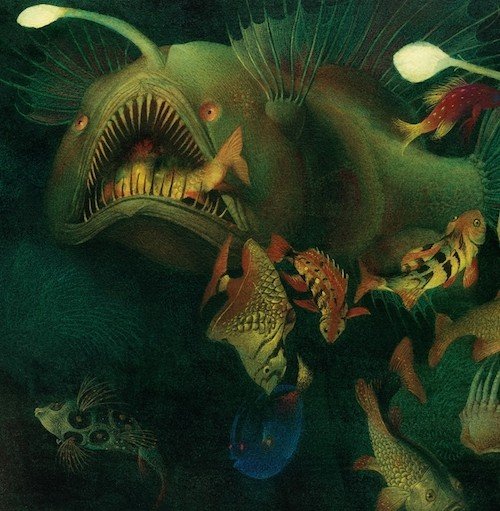
“I am an ANGLEFISH. As a female, I lure prey close to my mouth with the light that dangles from my dorsal spine. Smaller males join their bodies to mine, latching on with their teeth until their skin fuses into mine. I eat for us all, sharing the nutrients from my bloodstream. I see for us all when each male attached to me loses his eyes. That’s why I’m the most amazing creature in the sea!”

Amazing, for sure. Also horrific, nightmarish and spectacularly homicidal. Guiberson and Spirin show us a fantastical world that stuns the intellect, astonishes the eye, and confronts our deepest fears.

And don’t even get me started on Hagfish (aka ‘the snot fish’).

Most Amazing Vampire Squid

The Most Amazing Creature in the Sea is a thing of wonder. I may not ever want to meet one of these creatures outside of a Stephen King novel, but I marvel at their very creation. In compelling, but simple detail, Guiberson conveys the individual quality of each creature while making a case for their growing endangerment. As with Life in the Boreal Forest and Frog Song, the author’s notes include additional information about the environmental pressures faced by these and other creatures of the sea, as well as links to conservation organizations.

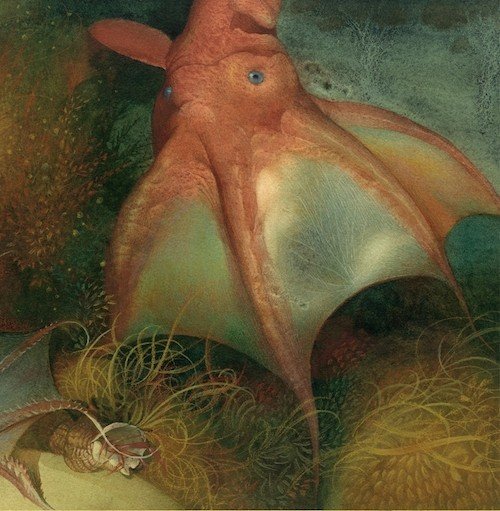
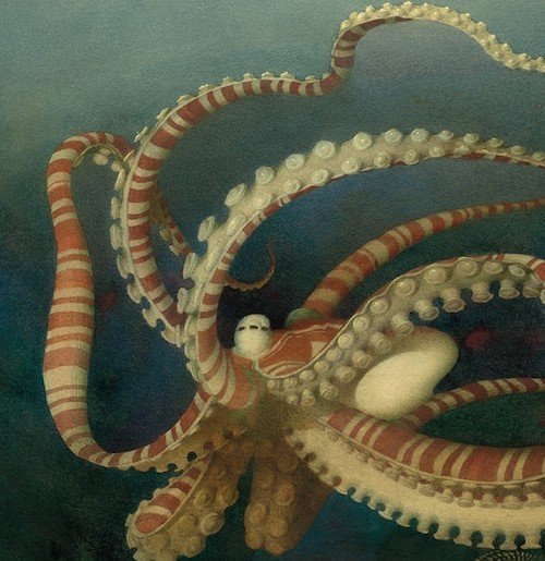
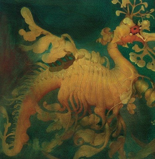
It is Gennady Spirin’s illustrations that elevate the book from an interesting and informative read to a work of art. How beautifully he imagines this undersea world! It’s as if someone has opened a long buried treasure chest and all the gold and jewels have wafted out, setting the sea alight. I try very hard not to draw a distinction between fine art and illustration, but as I have said before in other posts about this Russian illustrator, Spirin’s paintings are true masterpieces. They would be at home in a museum.

Most Amazing Box Jellyfish

In countless publications, most of them re-tellings of traditional folk and fairy tales, Spirin pulls out exquisite detail in tempera, watercolour and pencil, creating illustrations that appear torn from a 500 year old illuminated bible. They are luminescent, flecked with gold, delicately and richly coloured.

Most Amazing Mimic Octopus

The virtuosity of the illustrations suggest (or perhaps demand) a leisurely pace, but Spirin is prolific, which is great news for those of us who are greedy for each new publication. Interestingly, he does not discriminate – whether its Chekhov, Hans Christian Andersen or Brenda Guiberson – every illustration gig gets the full Spirin treatment. It’s not a stretch to think he (and Guiberson) reveled in the peculiar, almost supernatural details of these creatures, imbuing them with character in spite of their utter lack of charm. I’m sure they’re fine fellows in their own right, but as I have already mentioned, I’m not drawn to the ocean, but in the hands of a brilliant illustrator like Gennady Spirin, I find its creatures admirable, if only for the sheer weirdness of their existence.

Most Amazing Anglerfish

Gennady Spirin studied at the Moscow Art School and the Academy of Arts, as well as the Moscow Stroganov Institute, and currently lives in Princeton, New Jersey. Together with Guiberson, he has published three other books: The Greatest Dinosaur Ever, Frog Song and Life in the Boreal Forest. Beyond this, however, Spirin has created dozens of books, all of which are little masterpieces of illustration.

Brenda Z. Guiberson is an author and illustrator who has had a life-long interest in science. Hailing from Washington state, Guiberson has written many books for children, including Cactus Hotel, Spoonbill Swamp, Moon Bear and Disasters.

I am very happy to report that a sort of sequel to this book will be published in 2016 called The Deadliest Creature in the World. Here’s a sneak preview.

The Most Amazing Creature in the Sea by Brenda Z. Guiberson, illustrated by Gennady Spirin. Henry Holt and Company, 2015

I have also reviewed these other Gennady Spirin gems (click on link for reviews):Frog Song, Life in the Boreal Forest, Martha,various Christmas titles (short reviews)

Most Amazing Sea Dragon

  • Posted on October 31, 2015

The Dark Art of Halloween (updated for 2015)

October is but a mere few hours away from November’s hostile takeover and I’ve yet to post reviews of new Halloween books for 2015, mostly because I have only one. I’m sure there are more, but I’ve been bereft in my picture book trolling. Nevertheless, Leo: A Ghost Story is a gooder and I am happy to add it to my list of BOOtiful Halloween confections. And so, I bring you my annual celebration of the macabre, the creepy, and the deliciously twisted in children’s literature. Yes, this is a re-hash of previous Halloween posts and ghosts of Halloween’s past (CLICK on the links for longer reviews):

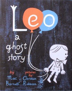
Leo a Ghost Story cover“Gary, I’m scared!”

This rather amusing statement initiates a series of events in Leo: a Ghost Story (Mac Barnett and Christian Robinson/Chronicle Books) resulting in a young ghost-boy leaving his home and venturing far afield in search of a more welcoming abode. Young Leo is self-entertaining house ghost occupying an old dwelling on the edge of the city. When a new family moves in, his friendly overtures are less than well received. The family calls in a scientist, a clergyman and a psychic to de-ghostify the house, which Leo believes is a waste of money. He knows he is unwanted.

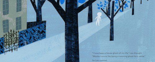
“I have been a house ghost all my life. Maybe I would like being a roaming ghost for a while.”

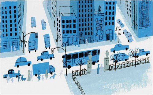
Leo a Ghost Story city

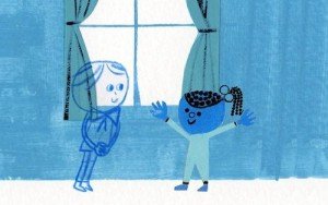
Leo says farewell to his home and ventures into the city. Judging by his Little Lord Fauntleroy attire, he is about a hundred years old, and the city looks very different to him. He is quickly lost in the bustling urban setting. The first person to ‘see’ Leo is a little girl named Jane, who invites him to play Knights of the Round Table. Jane takes Leo home, where both the girl and her parents assume he is imaginary. When Jane discovers he is a ghost, she’s pretty cool with it. In fact, she’s a pretty cool girl. Her games are imaginative and inclusive, and it’s wonderful to see her calmly accept Leo for who he is – a ghost in need of a friend.

Leo a Ghost Story sidewalk drawings

I am familiar with Mac Barnett of Sam and Dave Dig a Hole fame but had not heard of Christian Robinson until his name started popping up on the internet in gleeful anticipation of Leo: a Ghost Story. A previous winner of the Coretta Scott King Illustrator Honor for Josephine: the Dazzling Life of Josephine Baker, Robinson’s newest book retains the old-timey simplicity of form but introduces a Leo Ghost Story Leo and Janeminimalist and much bluer palette. The San Francisco-based artist uses acrylic paint and cut out construction paper to create his humourous and playful illustrations. Leo is a blue outline, but no less substantial than the rest of the characters – just a little more see-through. The use of varying shades of blue is a nice way to bring diversity to the page without being overt. Leo: a Ghost Story is also beautiful. The colours, though limited to blue, black, and orange (on the cover), are stark and chilly. A little haunted, but invitingly so. I’m with Jane on this one – I would share mint tea and honey toast anytime with Leo.

My only quibble – the title. Personally, I would have gone with Gary I’m Scared, or I See Blue People

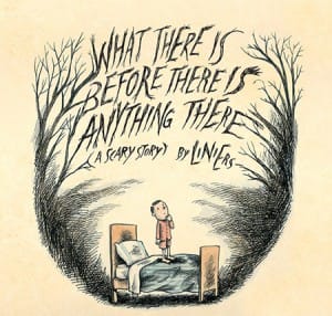
Liniers coverPublished in 2014, the truly scary WHAT THERE IS BEFORE THERE IS ANYTHING THERE by the Argentine cartoonist Liniers. This beautifully illustrated book is wildly funny, and surprisingly disturbing. As a former scaredy-cat kid, I can relate to the lad’s nightmarish visitations when the lights go out. Liniers balances humour with creeptastic (and yet somehow affable) creatures that do nothing but stare at the boy – until the thing that is there before there is anything there arrives. Yikes!

Read More

  • Posted on October 28, 2015

Job Wanted

I’ve been meaning to write about the wonderful illustrator Chris Sheban for some time now, almost fourteen years, although in my indefensible defense I’ve only had this blog for five of those fourteen years, and I have a lot of books.

I first came across Sheban’s work at a Washington, D.C. bookstore. It was a tall and slender book called The Shoe Tree of Chagrin, and it remains one of the best and most beautiful ‘finds’ of any trip I’ve experienced, which of course always includes a visit or two to a bookstore. One day I will write about that marvel of a book, but for now I have fallen mightily for a dog. A dog in search of a job.

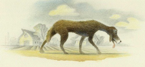
Job Wanted tired dog

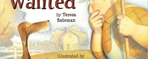
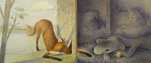
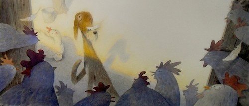
In Job Wanted, written by Teresa Bateman, an old dog must prove his worth to a farmer. It’s not stated why the dog is homeless, but suffice to say, he is an experienced farm dog with an empty belly, an imaginative mind and a willingness to do whatever it takes, including impersonating a cow. The farmer is not convinced, believing that dogs “just eat, and don’t give anything back”. (Clearly, this farmer has never owned a dog.)

“Do you have an opening for a cow?” the dog asked.

“Well sure. But, you’re not a cow.”

“We’ll see about that,” the dog said. “I’ll start work tomorrow.”

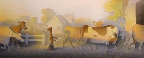
Job Wanted large cow scene

Job Wanted Helpful dog

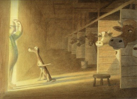
The next day, the dog prepares the cows for milking and the farmer is able to finish the job “in jig time”. Bateman uses this idiosyncratic turn of phrase several times, indicating that the dog’s helpful acts are having their intended effect. Following a confrontation with a fox, the farmer calls the commotion a “foofaraw”. These expressions are a nice bit of characterization, deepening the homey, mid-western feel of the book.

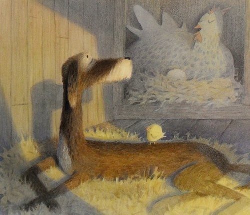
Job Wanted talking to a hen

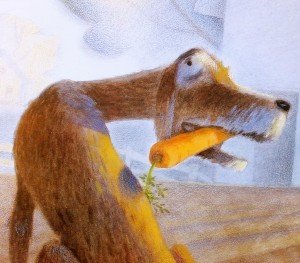
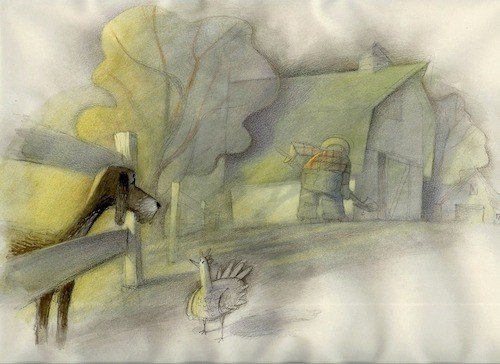
Wordplay is one of the many pleasures in Job Wanted, accentuated by Sheban’s magnificent watercolour, graphite and Prismacolour pencil illustrations. The Grant Wood-esque landscapes are rendered in sparse detail, allowing Sheban to direct his wondrous imagination to the farmer, the farm animals, and most impressively, the dog. With his grey-flecked snout, plaintive expression, and gangly body, we fall for the old mutt immediately. Surely he has proven his worth just by being so darn lovable? Well, as we learn, farm dogs must earn their keep. It is not enough to be cute (speaking for the farmer, because in my canine world being cute is more than enough).

Job Wanted Fox in Henhouse

Author and illustrator extract the maximum amount of humour, charm and pathos from this story of a dog who is not so much looking for a job as a home. It’s a testament to my investment in this story, and to dogs in general, that I experienced a fair amount of anxiety waiting for the farmer to accept this mutt into his life, and when it finally happens, it’s truly a lovely (and cathartic) moment.

Job Wanted in the henhouse

Sheban’s illustrations are like opals – soft and deep and ever-changing. Sometimes you see the blue, sometimes the gold, but every colour is present, if variably expressed. A translucent glow lifts the tones, Job Wanted dog detailbathing each wash of colour and pencil stroke in morning light. While it’s easy to be charmed by Sheban’s great warmth and humour, each illustration stands on its own as a thing of beauty – from the bespectacled farmer to the fat hens, and most of all an old hound dog who still has a few tricks up his hairy sleeve. If you’ve ever loved a dog, or needed a job, or worked on a farm, or if you just plain love funny, exquisitely illustrated picture books, then I would highly recommend that you pick up Job Wanted…in jig time.

Chris Sheban grew up in Boardman, Ohio, attending Kent State University followed by several years of graduate work. He has been awarded three Gold and three Silver Medals from the Society of Illustrators. Watch these pages (all 32 of them) for reviews of The Shoe Tree of Chagrin, and a couple of other Sheban beauties in my collection: The Story of a Seagull and the Cat Who Taught Her to Fly and Catching the Moon. Chris lives in Chicago, Illinois.

Teresa Bateman was born in Moscow, Idaho, but moved to Washington State when she was three-years-old. She is a school librarian, dog lover, storyteller and the author of many wonderful stories and poems for children. Her book Keeper of Soles is an ALA Notable Children’s Book.

Job Wanted by Teresa Bateman, illustrated by Chris Sheban. Holiday House, 2015.

Job Wanted sketch

Job Wanted sketch

  • Posted on September 03, 2015

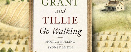
Grant and Tillie Go Walking

“I realized that all the really good ideas I’d ever had came to me while I was milking a cow. So I went back to Iowa.”  Grant Wood

How delightfully strange that a Canadian author and illustrator would create a picture book about the American painter Grant Wood. It’s doubtful that young readers, regardless of their nationality, will have heard of Grant Wood, and as a subject matter, the artist famous for the dour portrait of a farm couple and their pitchfork is, to say the least, an unusual choice. However, Grant and Tillie Go Walking works because author Monica Kulling and illustrator Sydney Smith have found a way to tell a fictional story that is suggestive of the life and artistic legacy of Grant Wood but still recognizably biographical. In melding fact and fiction, the story takes off, becomes its own thing – reverent but also charmingly re-imagined as the story of a man who takes the long way around to find what truly matters, and a cow who knew it all along.

Grant and Tillie apple

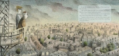
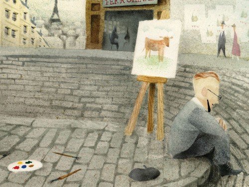
Grant and Tillie Go Walking is about two characters – an artist (Grant) and his cow, Tillie. Grant is a restless soul, disenchanted with the pastoral landscapes and quiet lifestyle of his family’s Iowa farm. He longs to paint like the French artists in Paris, and so abandons the farm and Tillie for the City of Lights. Tillie is inconsolable (as only cows can be in children’s books), giving little milk and refusing to go for walks without her best pal, in spite of the tender care of Grant’s mother. On the other side of the world, Grant adopts the lifestyle of the French painters and even dons a beret, but it is an invention – convincing no one, especially the French who are dismissive of Grant’s depictions of rural America. His dreams of home reveal a truth that is undeniable.

“Grant looked different, but inside he was still a shy, quiet man, and a slow painter.”


Grant Tillie Paris large

Grant Wood American GothicIn actuality, Grant Wood visited Europe four times over a period of years, but like the character in the book, he returns to Iowa to paint what is authentically meaningful to him – the American landscape. As an artist, Wood was inextricably shaped and inspired by his mid-west experiences. His very personal and unique style of painting is emblematic of an American art movement known as Regionalism, and his painting, American Gothic (depicted in the book), would become as internationally revered and recognizable as the masterpieces he studied in Europe.

Grant and Tillie cow painting

Grant and Tillie Go Walking is a gentle and beautifully realized portrait of an artist in formation. The old adage, write (or paint) what you know is an obvious motif, but running parallel is a story about bonding and connection – with the land, with wherever you call home, and with the person you truly are. And if you’re lucky enough to have one, your cow.

Kudos to Monica Kulling and Sydney Smith for creating a picture book for children about this artist, or any artist. While illustrated picture books introduce art to children indirectly as a 32 page work of art, books about art and artists for children are rare. Fictionalized accounts even rarer. How do you walk that line between biography and fiction? Sydney Smith’s illustrations in Grant and Tillie Go Walking are an homage to Grant Wood but still stylistically original. Even more surprising is how much they differ from his previous book, the exquisite Sidewalk Flowers, which draws from the graphic novel sensibility of dark outlines and a palette of primary colours.

I recently talked to the incredibly talented Sydney Smith about his approach to creating Grant and Tillie Go Walking. Here’s an edited version of our chat:

32Pages: In the publication notes, it states that you used watercolour, ink, and a toothbrush to create the illustrations. Can you talk about the process?

SS: I used mostly a stenciling method for this book. I would draw the various shapes on bristol board and cut them out using the positive and negative as masking for application of watercolour or ink. The toothbrush was for the splatter. I have used a similar approach before digitally and thought that the effect would work well in this case because the result could have a similarity to Grant Wood’s style of painting. His hills and trees were so rounded and rich. The non-digital approach is much messier. I am still finding small paint-splattered cutouts of cows and houses in my studio!
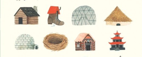
32Pages: How do you decide on style for a particular book?

SS: The hardest part of Grant and Tillie was deciding the approach. I had just finished Sidewalk Flowers but it didn’t feel right to do the same thing. The dark shadows and thick ink lines made sense for the city but in Grant Wood’s rural Iowa the images needed to be softer and reflecting his own style of painting.

32Pages: Were you familiar with the work of Grant Wood before you started this project?

SS: Like most people, I was familiar with American Gothic and I recognized a few other paintings of his but I wasn’t familiar with his story. He found his Regionalist style after experimenting with other styles that were popular at the time and I can relate to that. Also, moving to a big city and being overwhelmed, that’s something I can relate to as well.

32Pages: Was creating Grant and Tillie Go Walking an enjoyable experience?

SS: The most gratifying part was trying something new and taking a risk and seeing it through. I was working in a way I never have before and although the process was slow, it was worth it. And Monica (Kulling) is wonderful and prolific. She has an excitement and talent that is infectious. She is unstoppable!

Sydney Smith was born in rural Nova Scotia and graduated with a BFA from the Nova Scotia College of Art & Design in Halifax. He has illustrated multiple children’s books, including the wordless picture book Sidewalk Flowers. Sydney lives in Toronto.

According to her website, Monica Kulling “lived the life of a free-range kid” in British Columbia. She studied creative writing at the University of Victoria, and is the author of many books for young readers, including The Tweedles Go Electric and The Tweedles Go Online.

Grant and Tillie Go Walking by Monica Kulling, illustrations by Sydney Smith. Groundwood Books, 2015.

Previously reviewed – Sidewalk Flowers by JonArno Lawson and Sydney Smith.

An Educator’s Guide to Grant and Tillie Go Walking HERE

Sydney Smith Sketchbook at Sydney Draws

  • Posted on July 29, 2015

The Comic Art of Lynn Johnston

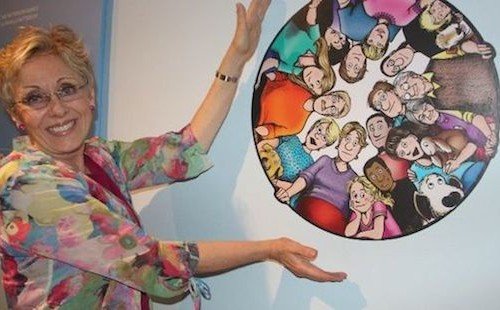
Few Canadian icons are as beloved as Lynn Johnston. Most everyone has read her Pulitzer Prize nominated comic strip For Better or For Worse, finding their own lives reflected in the everyday activities of the Patterson family. Unlike most comic strips, however, the characters aged and faced real-world issues that other popular forms of entertainment ignored. People, and I include myself here, were (and still are) emotionally invested in the characters and its creator Lynn Johnston. Now we have For Better or For Worse: The Comic Art of Lynn Johnston, and with it, a much richer portrait of the artist and woman behind the comic strip.

Published to coincide with an international touring exhibition of Lynn Johnston’s work (organized by the Art Gallery of Sudbury), For Better or For Worse: The Comic Art of Lynn Johnston is a retrospective of her best-loved strips, but beyond that, we are treated to her artistic development as a cartoonist and comic writer, or as Lynn puts it, “Fifty years of drawings, doodles, sketches, and scrawls”.

Lynn Johnston FarleyIt was an education that began almost at birth. Lynn’s aunt and mother were artists, and comic books and the ‘funny pages’ were not only encouraged they were preferred reading material.

Johnston’s father was a mild-mannered student of comedy, especially the slapstick shenanigans of the silent comedy era.

“We didn’t watch these films like an ordinary audience; we studied them. He would run scenes back and forth to show us how gags were set up, how everything was choreographed exactly to look spontaneous or to look like an accident. He wanted to see how comedy was created. If there was a formula to ‘funny’, he wanted to find out what that was.”

Nothing in the Ridgeway household was taboo, other than the expression of serious emotion and MAD Magazine, which her mother thought was crude. (Lynn read it anyway.) And still, growing up Ridgway had its challenges. Though generally supportive of her daughter’s early artistic explorations, her mother withheld praise and affection, and in combination with episodes of physical abuse, instilled a deep sense of insecurity and a combative, authority-averse impulsivity. An eccentric household steeped in the opposing forces of a passivity and dominance was the incubator of a great, if troubled artist, but as Lynn states, “If you can’t say it right out, joke about it.”

Of her early life and career, so much of it reads like the evolution of a woman destined to become a comedic artist: class clown, obsessive doodler, observant, irreverent, socially aware, outsider, genetically inclined to laugh at life. All of it poured into the comic strip that would make her famous, For Better or For Worse, which debuted in September, 1979.

Art Gallery of Sudbury 2

When For Better or For Worse first appeared in the newspapers, I read it not just as someone invested in the life of the Patterson family, but as an artist, enthralled (and more than a little jealous) of the beauty and fluidity of her line. The nuances and quirks of body language revealed at least as much (and usually much more) about the character’s emotional state as did the dialogue, deepening the humour and adding a layer of relatability unusual for a cartoon family.

The complex narratives captured in a few panels and a swish of her pen seemed effortless, but it’s a style that evolved over years of personal and professional illustration, samples of which are happily included in this book (and in the exhibition). As a Canadian, I was particularly pleased to see homegrown locations and place names show up in For Better or For Worse, which is a bold move for a Canadian comic strip with international aspirations.

On a personal note, I had the great pleasure of meeting Lynn Johnston on multiple occasions as a employee of a large, independent bookstore in Edmonton. She was always gracious and funny, easy to talk to, with large, beautiful blue eyes. She gave me a great piece of artistic advice which I adhere to – keep your originals. I sent her a personal thank you letter after one of her visits, and she replied – in her unmistakable handwriting. For several years we exchanged Christmas cards. Above my drafting table hangs a framed, personalized autograph with all the Patterson family. It is no word of a lie to say that Lynn Johnston is one of my artistic heroes, but with For Better or For Worse: The Comic Art of Lynn Johnston, she has become something better – a brilliant, messy, complex, and entirely original human being.

The Comic Art of Lynn Johnston

The first woman and the first Canadian to win the National Cartoonist Society’s Reuben Award for Outstanding Cartoonist of the Year, retired from creating new cartoons for the strip in 2010, but For Better or For Worse continues on in syndication, revisiting the early days of the strip for a new generation. In 1992, Lynn Johnston was made a Member of the Order of Canada, our country’s highest civilian honour

For Better or For Worse: The Comic Art of Lynn Johnston by Lynn Johnston and Katherine Hadway, published by Goose Lane Editions and the Art Gallery of Sudbury, 2015

  • Posted on June 30, 2015

Home

A very important person in my life once said that if at all possible, when writing, try to avoid cliché. I do my best. However, I can’t help expecting cliché from the children’s section in a bookstore. According to the American Library Association, there are 21,878 children’s books published every year, and I would guess that 21,700 of those are cliché. It’s endemic. Also, most authors have not met my very important person (unfortunately for them), and so have not been given this useful piece of advice.

The reason I am talking about cliché is that the recently published Home, which admittedly does tread over familiar territory, could have lapsed into cliché, but Carson Ellis takes the subject matter and twists it on its end. Her interpretation of the word home, and its depiction, is inventive and thoughtful. As one would expect of a Carson Ellis book (her first as author), the art is beautiful. The over-size pages allow the gouache & ink illustrations to breath in perfect balance with the white space. Home is an immersive book. Once you enter, you’ll never want to leave.

Home Shoe

There is no storyline in Home. Each page or double-page spread is a type of home. Sometimes the home is an actual abode, sometimes it is of no fixed address:

Home is a house in the country.

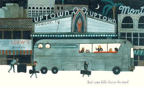
And some folks live on the road.

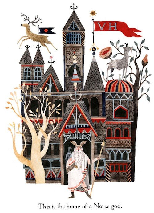
This is the home of a Kenyan blacksmith.

Sea homes. Bee homes. Hollow tree homes.

Home Norse

And so on. The narrative is in the illustrations, each of which invite further investigation. Why is that kid mooning his family on top of the shoe where they presumably live? Is that the artist herself, down below, drawing on the shoe? And are there really people, or something, living on the moon? There are a lot of laughs, some hidden, some obvious, in Home, but the best is the appearance of The Grateful Dead riding in their home – a tour bus, with Jerry Garcia visible in one of the windows. Then again, maybe it’s a bunch of hippie Deadheads following the band, or maybe it isn’t the Dead at all. I know that Ellis designs album covers for The Decemberists, so perhaps it’s them on the bus. This amusing detail will be lost on children, but even without knowing the character’s true identities, the illustration would still be funny and engaging.

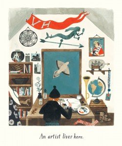
Interestingly, the second last page is reserved for the artist in her studio, and on the wall are trinkets and references from the previous pages, including an ‘all-access pass’ lanyard. To the Dead? To the Decemberists? By giving just enough detail, visually and narratively, Ellis leaves room for additional storytelling. She poses interesting questions and answers a few, but for the most part, Home is a place of imagination. Home could be anything, or anywhere.

Home Grateful Dead

My favourite journey is the one home. I’m an introvert. A homebody. It’s not that I don’t like to travel, but when I do, a part of me can’t wait for it to be over so that I can relive it. At home. I am predisposed to love a book that celebrates my favourite place, but I think I would love anything by Carson Ellis. I first became aware of her art with the 2010 publication of Dillweed’s Revenge: A Deadly Dose of Magic, written by Florence Parry Heide. This book in particular has a comically macabre, Goreyesque flavour, probably because of the subject matter, but I don’t see this in Home. It is comic, but Home is also a flat-out work of art – stunning, culturally diverse, and beautifully imagined. It is one of the most exquisite books published this year (or any year), and I expect to see it on many best-of lists at the end of 2015, including mine.

Home In StudioCARSON ELLIS was born in 1975 in Vancouver, Canada. She was raised in suburban New York and college-educated at the University of Montana in Missoula, where she earned a BFA in Painting in 1998. She received a 2010 Silver Medal from the Society of Illustrators for her art in Dillweed’s Revenge. She is the illustrator of The Composer is Dead by Lemony Snicket, and has collaborated with her husband Colin Meloy on the best-selling Wildwood series. Carson lives in Portland, Oregon with her husband and sons, and according to her website, an unfathomable multitude of tree frogs.
HOME by Carson Ellis. Published by Candlewick Press, 2015
 Watch Carson Ellis introduce HOME
  • Posted on June 10, 2015

The Skunk

There is a type of plot device I find irresistible: when a seemingly innocuous element is introduced into a story which proceeds to throw the protagonist’s life into chaos. One of the best examples is Patrick Süskind’s The Pigeon, but it doesn’t really matter, because what’s true in fiction is often true in life. For most of us, a certain predictability is desirable. Though we may rail against it, routine is stabilizing, even comforting. When it is disrupted, everything, and everyone, falls into question, and who we become in the midst of uncertainty is where the real story begins.

The Skunk doorstep

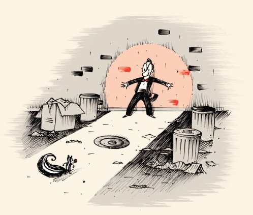
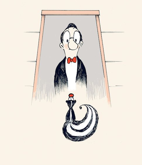
In Mac Barnett and Patrick McDonnell’s wonderfully sly new picture book The Skunk, a man is utterly discombobulated by the sudden appearance of chaos on his doorstep. Chaos, in this particular instance, takes the form of a skunk, as the title suggests. Not a normal skunk, which would unnerve anyone, but a skunk in dogged pursuit of some unnamed thing…or person. Impeccably dressed in a tux and bow-tie and on his way to the opera, the man does not wish to startle the skunk, so he backs away The Skunk sidewalkslowly and heads down the street. The skunk follows. The creature is neither friendly nor unfriendly, but he is always there, around the corner, sitting at a nearby table, matching the man’s actions move for move. The man confronts the skunk, offering various forms of appeasement like a saucer of milk and his own pocket watch, but the skunk is not interested. His paranoia rises. The skunk continues his pursuit from cemetery to carnival, finally cornering the man on a dead-end street. We never find out the skunk’s true intent because the man jumps down the sewer and starts running until he ends up in another part of the city. He buys a new house and starts his life over. But even as he celebrates, the anxiety persists. Something is missing.

“I thought about the skunk. What was he doing? Was he looking for me? Was he back in his burrow? Was he following someone else? I left the party to find my skunk.”

My skunk.

Is The Skunk the first children’s picture book to explore Stockholm Syndrome? Nah. Maybe. It would be easy to write an entire review about the psychological undercurrents in this book (I’m already half way down that path), but it would be at the cost of its other pleasures. Simply put, The Skunk is very clever storytelling. The entire idea is funny, and Barnett’s pacing is exquisite, building slowly to a twist (and slightly twisted) ending.

The Skunk dead end

And then there is Patrick McDonnell’s art. McDonnell has been such a frequent subject in this blog, I should have exhausted my superlatives long ago, but his artistic brilliance continues to inspire even as my ability to praise (in an original way) shrinks. The teaming of Barnett and McDonnell is perfection on a number of levels. Considering the subject matter, one might expect the skunk to appear menacing, but just the opposite is true. McDonnell’s skunk is adorable. His bushy tail curls over like a musical note, sweetly dwarfing the rest of the skunk’s tiny body, and his facial features bare some resemblance to the loveable cat Mooch from McDonnell’s cartoon strip Mutts, especially the red, over-sized nose. Throughout the book, McDonnell’s beautifully realized illustrations – master classes in characterization and line – bring humour and light to each scene, even as the story darkens.

But the apparent innocence of the skunk is deceptive, or at least, dual-purposed. With the exception of the last scene, the skunk’s face is expressionless. Calm. This makes it impossible for the man to know the skunk’s real intent. Is it malicious, or just a poorly expressed attempt at friendship? It’s possible he is over-reacting to the situation, but then again, maybe not. Chaos. The unknowable is what drives the man to make a desperate move and start a new life on the other side of town. The funny thing is, when the skunk is no longer in pursuit, he misses it. He goes after it. The pursued becomes the pursuer. In spite of the title, The Skunk is really about the man. The skunk doesn’t change. This is why teaming McDonnell with Barnett is so perfect. If the skunk had been an obvious baddie, the story could be read in a more straightforward way, but thanks to the subtle, artful intelligence of McDonnell and Barnett, there is much more going on. More questions, more nuance, and certainly, more fun.

The Skunk is brilliant and inscrutable, and like the character(s) in the book, it will stick with you for a very, very long time.

The Skunk looking up

Mac Barnett is no stranger to funny, occasionally subversive kids books. Just within the last couple of years, the prolific, California-based author has written at least two books that share a mischievous affinity with The Skunk: the take-down masterpiece Battle Bunny, and the award-winning Sam and Dave Dig a Hole, beautifully illustrated by a fellow-subverter Jon Klassen. (Barnett previously teamed with Klassen on Extra Yarn.) I am giddily looking forward to the upcoming Leo: A Ghost Story (illustrations by Christian Robinson), to be published in August.

Patrick McDonnell is the creator of the incredibly endearing, kind-hearted, and funny cartoon strip Mutts. Aside from the annual collections of his strips, McDonnell has also written and illustrated several stand-alone picture books, including the Caldecott Honor-winning Me…Jane (about Jane Goodall’s childhood), and my personal favourite South. I have reviewed most of Patrick McDonnell’s books, and rather than list them here, please click on the Picture Book Archive on the left hand side and scroll down the list for additional reviews. McDonnell is a member of the national board of directors for both the Humane Society of the United States and the Fund for Animals. His art is beautiful. He is beautiful. I can’t say enough.

THE SKUNK by Mac Barnett, illustrations by Patrick McDonnell. Published by Roaring Brook Press, 2015

For a mini-review of Battle Bunny, click HERE and scroll down. For another mini-review of Sam & Dave Dig a Hole, click HERE. (Both books deserve longer reviews, I know. Until then, I strongly recommend both books. Strongly. Recommend.)

  • Posted on May 17, 2015

Sidewalk Flowers

This is it. Sidewalk Flowers is one of those books. A book that gets it right. All of it. The writing, the tone, the illustrations, and above all, the sentiment. At its core Sidewalk Flowers is a story about Sidewalk Flowers coverkindness, and radiating from that – gratitude and appreciation. It’s also about opening our eyes, seeing the small things that so often pass us by.

Author JonArno Lawson found the perfect illustrator in Sydney Smith and together they create a world that is decidedly urban, but not cold. It’s true there is little colour at the beginning of the story, but the scenes are rich with life – if you just know where to look.

Sidewalk Flowers picking dandelions

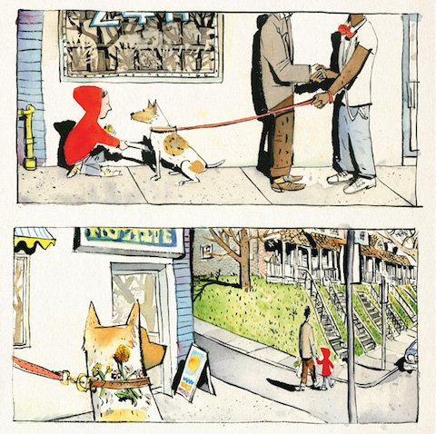
The fact that a young girl is able to find quiet beauty in her bustling surroundings is not surprising. Children are very good at noticing what we ignore; what we are too distracted or hurried to see. The wordless story is told in a series of panels, almost like a graphic novel. In an otherwise black & white setting, the only colour is the red of the girl’s hoodie as she walks hand in hand with her father through the city streets. This is a particularly good device, as the vivid colour draws us in, slows us down, until we see what she sees: a yellow flower growing in a crack in the sidewalk, a stand of fruit, a woman’s flowery dress, the little lives that are lost, the big lives that are equally lost. She places her flowers on the breast of a dead bird, picks more flowers – drinking in their scent. She hooks a purple flower into the shoe of man sleeping (sleeping it off?) on a park bench. In one of the loveliest scenes of the book she shakes the paw of a dog and then places a bouquet under his collar. Unlike her father who is busy with his errands and only passively attentive to her, the girl is engaging directly with her world, and in a quiet, childlike way, she is saying  – I SEE YOU. Sidewalk Flowers reminds us that at every moment, we have a chance to do something meaningful, even if it’s just acknowledging what, or who, is in front of us.

Sidewalk Flowers four panel

It’s important to note that the first flower she plucks from the sidewalk is not in fact a flower but a dandelion. A weed. To the girl, to any child, it is a beautiful flower, and she is right; dandelions are beautiful, but our ingrained adult prejudice prevents us from seeing a dandelion as anything but an annoyance, if we see it at all. In truth, dandelions are the first ‘flower’ of spring, dotting the landscape with bright colour and providing the first food for hungry bees, butterflies, and other insects. They are useful and deserving of our appreciation, if for nothing else than their ability to push though the meanest of circumstances, like a crack in the sidewalk, and thrive.

Sidewalk Flowers dog

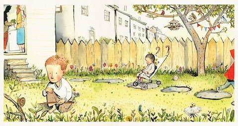
The girl doesn’t know this, of course; she just thinks the weeds are pretty and that is enough, and when she feels moved, which is often, she shares her bouquets. These small acts of kindness go unseen by anyone except the recipients of her generosity and the reader, and in this way, the perspective is nicely played with, giving us a glimpse into her world, but also allowing us to watch her interact within this black & white urban setting, as if she herself is the flower. The vignettes gradually infuse with colour as the girl nears home; Lawson’s watercolours becoming softer and more saturated, particularly in the family scenes toward the end. And still, we see her – the little girl in the red hoodie, flower in her hair, surrounded by beauty wherever she goes. It’s all about the perspective, you see.

Sidewalk Flowers backyard

A three-time winner of the Lion and the Unicorn Award for Excellence in North American Children’s Poetry, JonArno Lawson is the author of numerous books for children and adults, including Enjoy It While It Hurts, Down in the Bottom of the Bottom of the Box, and Think Again. He lives in Toronto with his wife and three children. Great interview HERE about writing a picture book without words.

Sydney Smith was born in rural Nova Scotia, and has been drawing since an early age. Since graduating from NSCAD University, he has illustrated multiple children’s books, including the wordless picture book Sidewalk Flowers, and he has received awards for his illustrations, including the Lillian Shepherd Memorial Award for Excellence in Illustration. He now lives in Toronto and works in a shared studio space in Chinatown where he eats too many banh mi sandwiches and goes to the library or the Art Gallery of Ontario on his breaks. Read how Smith created the illustrations for Sidewalk Flowers HERE.

Sidewalk Flowers by JonArno Lawson, illustrations by Sydney Smith. Published by Groundwood Books, 2015

Sidewalk Flowers looking up

  • Posted on April 30, 2015

Outstanding In The Rain

Originality in children’s picture book illustration is a rarity, so when it comes around, it knocks your socks off, or sandals, depending on the weather. Outstanding in the Rain, Frank Viva’s newest book and the fifth in four years by this Toronto-based designer and illustrator, already feels like a classic, with the visual pop of a beloved mid-century picture book, re-imagined and re-energized for modern tastes. It is zingy and a little loopy, and I guarantee there is nothing else like it on the shelves, unless you include Viva’s previous books, and even then, Outstanding in the Rain is still entirely its own wonderful thing.

Outstanding in the Rain slide

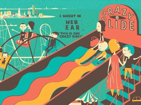
I think the word that best describes Outstanding in the Rain, and all of Viva’s work, is inventive. And then – pick your adverb: playfully, beautifully, delightfully, knee-slappingly, humourously, ridiculously…ETC. The inventiveness, in this particular case, is not in the story but in how the story is told. A boy and his family spend the day at an amusement park (Coney Island) celebrating his birthday, going on rides, eating junk food, playing on the beach, and getting caught in the rain. A typical carnival narrative, which is secondary to the wordplay evoked by the clever use of momentum-building die-cuts: ICE CREAM becomes OH NO I SCREAM on the next page (as a result of a toppled cone), followed by THOSE SANDWICHES THERE to ON THE SAND WHICH IS THERE, and so on. As each page is turned, the die-cut frames an image from the previous page, transforming it into an entirely new thing. To quote the book jacket, Outstanding in the Rain, itself a play on words, is ‘A Whole Story With Holes’.

Outstanding in the Rain scream

It is also a whole story with a whole lotta beautiful art. With relatively few words in the book, and an equally minimalistic (but definitely not subdued) palette, the story still feels big and boisterous. It is a cartoon without being cartoonish. Perhaps it is the highly stylized shapes – loosely human and loosely architectural – where nothing is detailed but a lot is going on and everything is recognizable (if not comically exaggerated). Or the graphic sensibility that underpins the design, even as it simultaneously plays with it. One thing is obvious: Frank Viva is a master of colour. His books vibrate. This is particularly true with Outstanding in the Rain, which has (I swear) an audible hum as the blocks of turquoise, umber and orange spark and bump up against each other on the page. For children and adults, the book demands multiple reads to take in all the narrative and visual mischief. Outstanding in the Rain is, in short, a carnival, and twice as much fun.

Outstanding in the Rain roller coaster

I have a theory. Outstanding in the Rain is either number three of a trilogy or part of an ongoing series. In Along a Long Road, the cyclist passes an ice cream truck (and, I should add, an amusement park). In A Long Way Away, there is an ice cream truck, perhaps the same truck, on a road. In Outstanding in the Rain, an ice cream shop is front and centre. Either it is intentional and this book is connected to the others by the appearance of ice cream in one form or another, or Frank is subconsciously controlled by frozen desserts. If it’s the former, bravo, if it’s the latter – Mr Viva…I can relate.

Outstanding in the Rain authorFrank Viva is an award-winning illustrator, designer, and presumed ice-cream lover. His brilliant work frequently graces the covers of The New Yorker, and other magazines. According to his website, Frank also likes bikes and public transit, and is the founder and managing director of Viva & Co.

Outstanding in the Rain by Frank Viva. Published by Tundra Books, 2015

Other reviews (click on links):

Young Frank Architect by Frank Viva (Museum of Modern Art, 2013)

A Long Way Away by Frank Viva (HarperCollins, 2013)

Along a Long Road by Frank Viva (HarperCollins, 2011)

Here’s a wonderful article from the New Yorker about the creation of Outstanding in the Rain